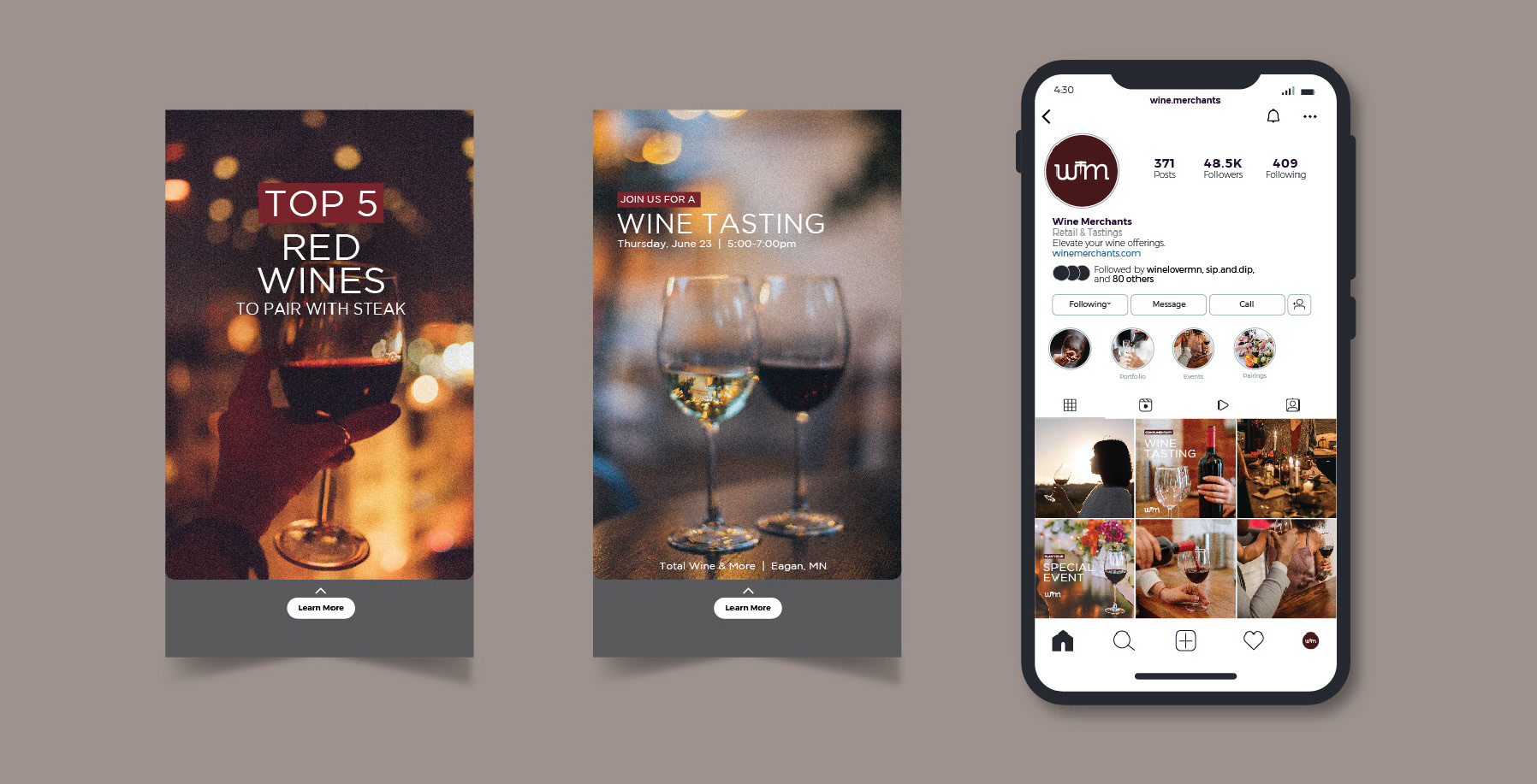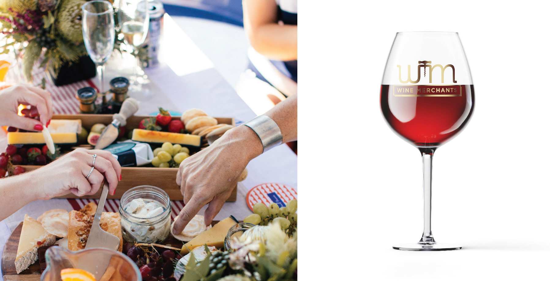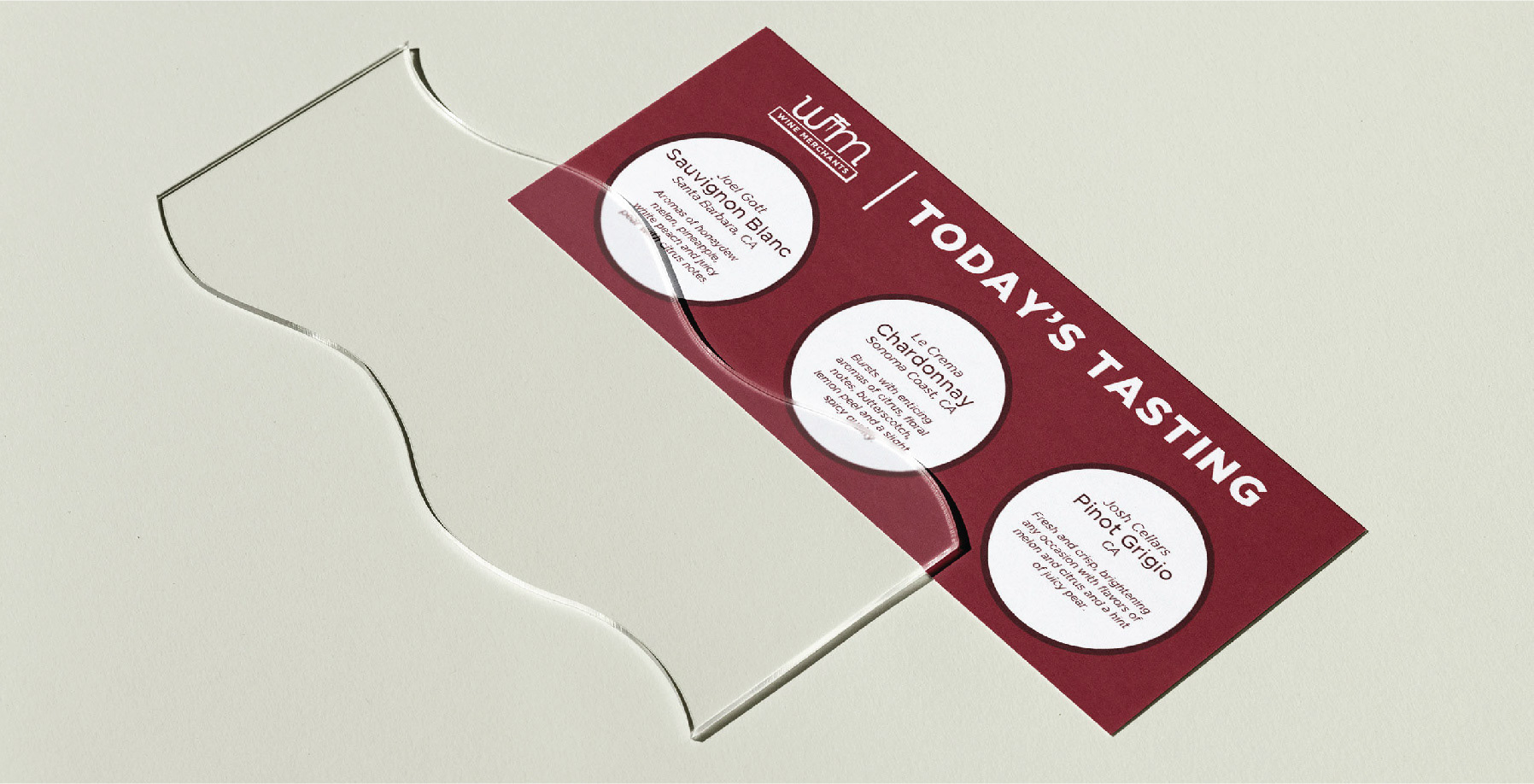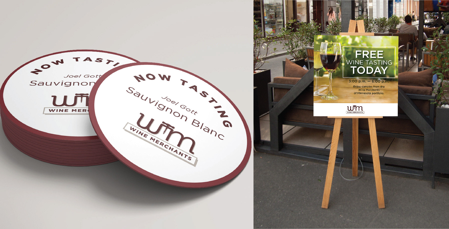
Wine Merchants is a sales division at Johnson Brothers Liquor Company, one of the largest liquor distributors in Minnesota. As the Wine Merchants team grew they realized their logo had not evolved in several years. Their design brief requested a modern logo with a clean, sturdy typeface that could be used on anything from posters to full page wine menus. I used sophisticated brand colors, a versatile typeface, and warm photography that focuses on gathering moments made better with wine.
Project Type: Brand Identity
Role: Designer
Tools Used: Adobe Illustrator
Year: 2017
Role: Designer
Tools Used: Adobe Illustrator
Year: 2017

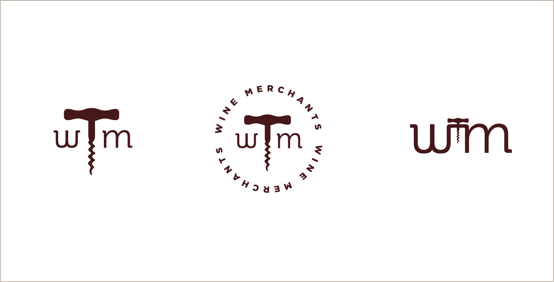
Original Logo
The original logo had an outdated illustration style, did not scale nicely when reduced in size, and the typeface felt stretched to fill the bottom space.
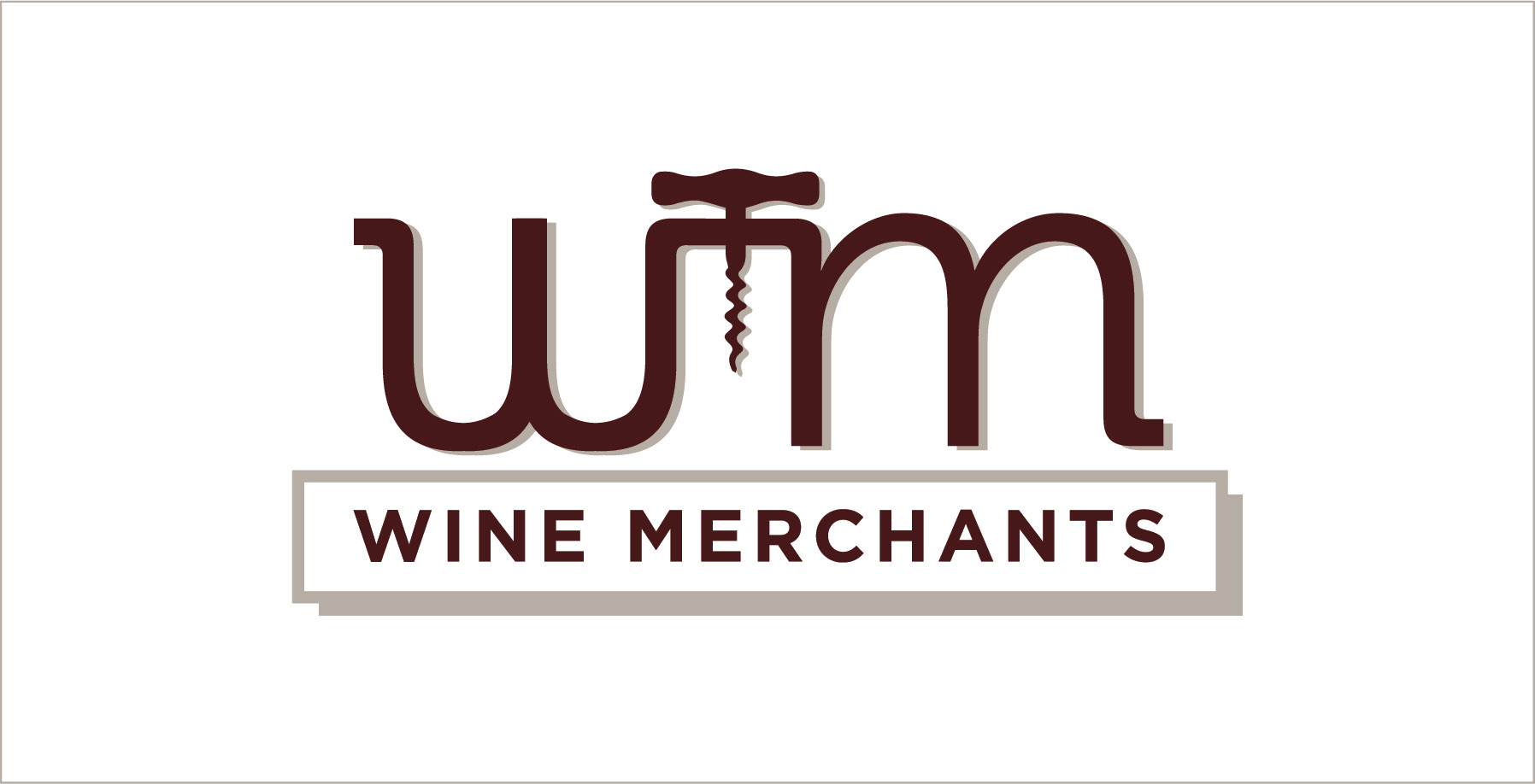
Redesigned Logo
The logo solution clearly represents the division's priority towards their wine portfolio, pairs two modern typefaces, and scales easily to any size. The extended lines on either end of the lowercase "w" and "m" show the continued focus towards growth and success for the Wine Merchants' future. The deep burgundy brand color harkens back to the rich grape hues in their products while the silky greige is reminiscent of a cork.